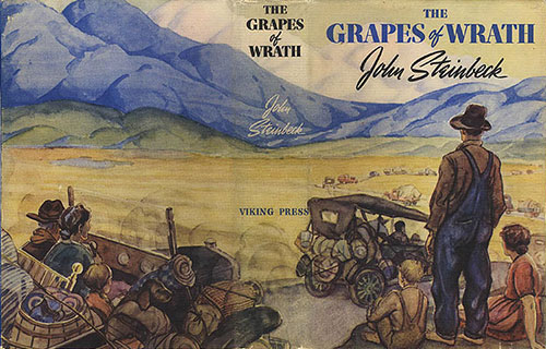
In the world of books—hardcover anyway—the dust jacket has been around since the 1820’s. Apparently, they were created (in England) to protect cloth bindings, which were, now and again, embossed, and sometimes even gilded. In those days the dust jacket was meant to protect the book from, well, dust. Moreover those jackets were sealed like a package, then removed when the book was put on display or, of course, read.
It took a hundred years or so for dust jackets to evolve into what we know today, artistically (we hope) designed to attract the eye of the viewer. Now it’s also just folded over the book, and easily removed. That said, if you collect rare editions, say The Grapes of Wrath, and the volume has its dust jacket (intact) it very much ups the price.

(If you wonder why Dust Jacket retains the name, how many of you keep driving gloves in the “glove compartment” of your car?) I am often asked how I go about designing the covers of my books, and people are surprised to learn that I actually have no control over that, at least no contractual control. Still, over the years, editors have been willing to share early cover ideas with me, and I can give a response. Generally speaking (but not always) my thoughts are included in the process.
In my early years some of the covers were quite awful. One such cover, Who Stole the Wizard of Oz? took a moment from the book to illustrate. But the image—a boy and girl—actually reversed the placement of the kids, putting the boy in a dominant position, while the text reads quite otherwise.
In my publishing history I actually offered two designs for covers, which were used. One was Don’t You Know There’s a War On? Moreover, the image of the boy (looking at him from the back) is taken from a photograph of my son, Robert, which I supplied.

The other design was for my forthcoming The Button War. The buttons depicted, are in fact the military uniform buttons (World War 1) that I collected as part of my research for writing the book. I think it unusually striking.
That said, when books are published in other countries the covers often change. Here is The Button War, in its UK edition.
I once had a collection of Nancy Drew and the Secret of the Old Clock (the first in the series). Over the years, while the text did not change, the cover did, mostly in terms of clothing fashion and Nancy’s haircut.

When Poppy and Ereth was first published, Brian Floca, who did the cover, complained to the publisher that they had changed the color of Ereth’s teeth. They should have been—as in nature they are—yellow. The cover depicted them as white. Subsequent editions got it right.
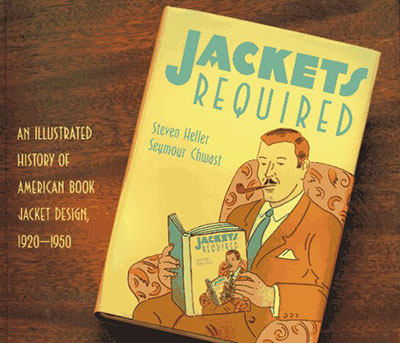
In my library I own a book titled, Jackets Required: an Illustrated history of American Book Jacket Design, 1920–1950. Many of the covers are quite stunning. Great covers are sadly rare.

My guess is that books with poorly designed dust jackets more often than not, well, collect dust.

