If you think as I do, that the physical book can be a form of art, then typography (a 1664 word) has been defined as, “The action or process of printing; especially the setting and arrangement of types and printing from them; typographical execution; hence, the arrangement of words on a page,” is vital to the art of bookmaking.
Beginning with Gutenberg, the type was set letter by letter, with the spacing (called leading) between letters and words. This had a vital impact on the eye. If you have ever seen a page of beautifully set hand type I think you will recognize it as, well, very beautiful to the eye.
It is a fact that as I type these words on my computer the typography is done for me. Yes, I am given a choice of spacing: “Normal, Expanded, and Condensed.” I can make the letters bold. I can also change the spacing between lines. And my computer gives me a fairly large choice of fonts.
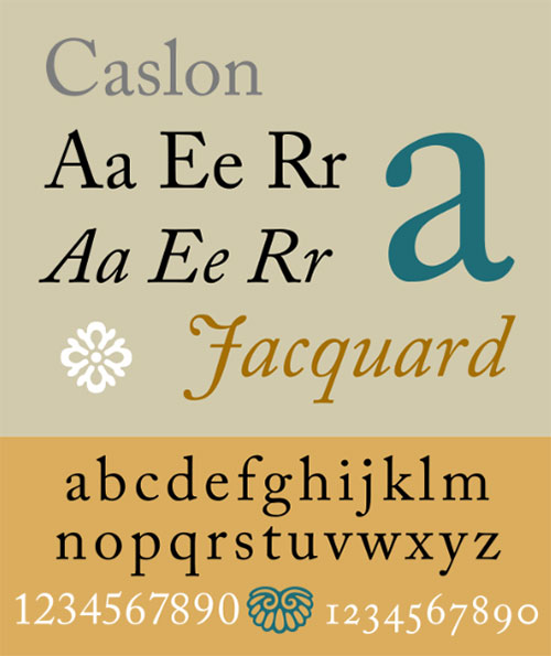
My own favorite font is an 18th-century type called Caslon, named after William Caslon the Englishman who designed it in 1722. I find it clear, and graceful, with subtle elegance.
You can see Caslon online, and even add it to your computer fonts from a number of sources.
I can recall fondly a chat I once had with Kevin Henkes, about how we both liked to choose the font for the manuscript we were composing. We agreed that, as we wrote, it made a difference. I also admit, I’m not sure why.
All of this is a preface to a fascinating article I came upon in The Atlantic Magazine (May 2018) titled, “The Scientific Case for Two Spaces After a Period.”
It appears that Skidmore College’s Department of Psychology did a study and determined that “All readers benefit from having two spaces after periods.” The researcher, Rebecca Johnson, said “Increased spacing [of text] has shown to help facilitate processing in a number of reading studies removing the spaces between words altogether drastically hurts our ability to read fluently while increasing the amount of space between words helps us process the text.”
Let it be said, however, that The Chicago Manual of Style and The Modern Language Association Style Manual, opt for one space after the period.
I did an experiment. I took the computer manuscript of my current project and got the computer to change the spacing of all my sentences from one space after the period, to two.
It took a matter of seconds.
To my eyes it did make a difference, making the text much easier to read.
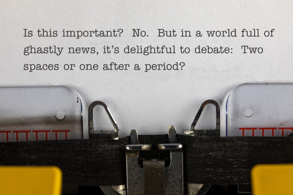
Is this important? No. But in a world full of ghastly news, it’s delightful to debate: Two spaces or one after a period.
Do weigh in.
But for my part, if you hear me say, “Hey, pal, gimme some space,” you’ll know what I mean.
1 thought on “Give Me Some Space”
I find the art of typography fascinating, but after spending decades as an editor, two spaces just looks: wrong. Love the post!