You may not know it but there is such a thing as the “Golden Ratio,” which suggests the best way to create a written page layout. This Golden Ratio comes to us from very ancient Greek geometry and mathematics, in particular the work of the philosopher and mathematician, Pythagoras, born about 570 BCE. But the first known reference to the term comes hundreds of years later from Euclid. These are names you may recall from your high school Geometry class. You might think they have nothing to do with modern book publishing, but they do.
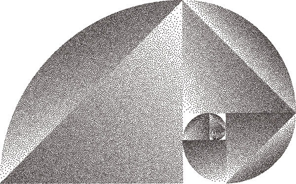
The standard definition of this “Golden Ratio” is achieved when you set page margins of 2.23″ on all four sides of 8.5″ × 11″ paper. That seems to be close to the golden ratio.
I got to thinking about this because I was printing out a new manuscript, preparatory to reading and editing it. While I do compose my work on a computer, and thereby endlessly read and reread the text on a screen, I find I need to go to a text printed on paper to do my fine editing.
When I do that, I am always—rather mindlessly—setting up the margins. This time—for no particular reason—I thought about that “Golden Ratio.”
Does it matter?
A digression. Years ago, a good friend asked me to read a manuscript someone they knew had written.
Out of friendship with that person, I agreed.
When I pulled the manuscript out of its envelope I found (this was before the common use of computers) it was about a hundred and fifty pages long, single-space typed, with page margins at about half an inch on top, bottom, sides.
I think I audibly gasped. It was all but a solid block of words—as far from the Golden Ratio as one could get.
It was, to my eyes, unreadable.
I returned it to the author and suggested it be, at least, reformatted in Golden Ratio format.
I never saw it again.
Granted, an extreme case. But I do know that when I randomly meander through a bookstore (or a library) the way a book is published influences what I choose to read.
So it is, over the years I have experimented with page format. I have (with a computer) shaped my text so it has the dimensions of a paper book text. I have laid it out with double columns. As I have discussed elsewhere here, I have used different fonts. What I am trying to do is read my own work in a different way, so that I am reading it, not just slipping, and sliding over a very familiar text.
But guess what? I inevitably create a printed text close to the Golden Ratio.
It truly is much easier to read.
Do I understand why? No. Nor have I explored the reasons as to why it works. I just know a text set forth in the “Golden Ratio,” is easier, and more pleasant to read.
Good enough for the ancient Greeks. Good enough for me.